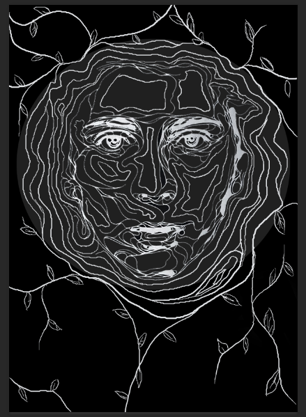
Following my targe audience feedback I made the appropriate changes to my poster to suit their needs. I am quite happy with the shape it has taken now as it looks far more like an actual movie poster.
Tuesday, 2 February 2016
Monday, 1 February 2016
Adding Colour
I knew that adding colour would have a huge effect on the overall outcome of the poster so I experimented with a range of green hues. I primarily created a colour layer beneath the white illustration and above the black/grey background. I realy like the effect the airbrush tool had on the colour, it left it smooth and seemless like skin tone, but green. I started by selecting a large brush, around 200, selected a dark green hue and began to block i the dark areas of colour. As I worked my way closer to the higher parts of the face the natural contour, I then decreased my brush size and adjusted my colour closer and closer to white from dark green. I am pleased with the outcome, as I didnt think it would turn out as effective.
Sunday, 31 January 2016
First Shot Animated
I published the first shot to YouTube so that you can see how it came together after constructing it.
First Shot Construction


Then I opened window > Timeline and changed the frame rates per second from the automatic 30 (for live film) to 12 (for animation).
The next task was drawing a simple tree design, adding an image layer and a video layer. Once I had drawn the tree then on the unmovable image layer I realized I had made a mistake. I wanted the tree trunk and grass to stay in place but I wanted the leaves to move, the leaves that I had already drawn on the image layer...
So i made a new layer and redrew the tree over the top of the previous image layer as I needed to clean up the lines anyway.
This was the result I was left with when I hid the first layer. Almost identical but a little cleaner cut.
I then went in frame by frame redrawing the leaves each time.
After I had about ten frames of the leaves moving, to work smart and not hard I duplicated the frames rather than redrawing them another coupe of hundred times, creating then a video layer group.


ttt
Saturday, 30 January 2016
Thursday, 28 January 2016
First Draft (2) of my Movie Poster
So here I completely changed the concept and layout of my poster to suit a more sophisticated audience.
I asked 10 of my target audience then to give me constructive feedback:
1. Needs an age rating.
2. Possibly change of font in places.
3. Needs a star rating.
4. Missing rating box.
5. Excellent composition and imagery.
6. Like the illustration, lacking colour though.
7. Very dark, try brighten it up in places.
8. Nice structure and drawing, wouldn't change it.
9. Make font bolder in places to stand out more.
10. Love it! So eye-catching!
Sunday, 24 January 2016
Change In Mind
After a little deliberation and really studying how my movie poster was turning out I decided that the whole poster was too overpoweringly green. The poster was supposed to be aimed to a more sophistocated audience, but this was looking very childish, very picture book like. It was supposed to be imagery that really stood out, was unique and eye-catching and enticed the older audience. I'm glad I realized the effect the imagery had at this early stage, it gave me the option to go back and fix it. To fix it, I simply restarted. Not an easy decision to make but I knew it would make a huge impact on my final product. And it wasn't as if I was completely restarting, I had all my important layers saved so I could re-edit them back together.
 |
|
 |
|
 |
|
 |
|
 |
| (cropped out image) |
Subscribe to:
Posts (Atom)


