Showing posts with label Movie Poster. Show all posts

Tuesday, 22 March 2016

Tuesday, 8 March 2016

Movie Poster Advertisement

I placed my movie poster on several different types of public spaces, such as Bus stops, billboards and the side of buses to make sure I reached the full target audience for advertising.


Monday, 7 March 2016

Target Audience Feedback on Poster

Here I have made a Padlet page to let my peers and others express their opinion on my draft, and see what constructive criticism they could give me to improve on.


Wednesday, 17 February 2016

Sunday, 14 February 2016

Finishing My Movie Poster

Once I had the main part of my image drawn, I knew that half of the struggle was already over, this left me time to enjoy composing my idea and bring it all together. That left constructing all the layers together. To do this I first of all found the images on google images, made sure there was either no copyright or I got permission to use them. I found the credit block on an open blog, complete with instructions on how to download it to use on Photoshop. Once I had my writing placed in the template I then again went back into its features, stretching it and warping it to make the perfect credit block. I made sure the font was then centered. As you can see I stretched it 130% in height and condensed its with to 85%, also resetting the spacing settings to 25, so that it wasn't too squished and still readable.


Saturday, 6 February 2016

Font Experimentation

Here is some of the experimental fonts I have been testing out to match my poster. Picking a font is easier like this because I can compare products side by side. Personally, I like the last version best. I changed the size and width to manipulate it to fit.


Tuesday, 2 February 2016

Second draft of my Movie Poster

Following my targe audience feedback I made the appropriate changes to my poster to suit their needs. I am quite happy with the shape it has taken now as it looks far more like an actual movie poster.


Monday, 1 February 2016

Adding Colour

I knew that adding colour would have a huge effect on the overall outcome of the poster so I experimented with a range of green hues. I primarily created a colour layer beneath the white illustration and above the black/grey background. I realy like the effect the airbrush tool had on the colour, it left it smooth and seemless like skin tone, but green. I started by selecting a large brush, around 200, selected a dark green hue and began to block i the dark areas of colour. As I worked my way closer to the higher parts of the face the natural contour, I then decreased my brush size and adjusted my colour closer and closer to white from dark green. I am pleased with the outcome, as I didnt think it would turn out as effective.


Thursday, 28 January 2016

First Draft (2) of my Movie Poster

So here I completely changed the concept and layout of my poster to suit a more sophisticated audience.


I asked 10 of my target audience then to give me constructive feedback:

1. Needs an age rating.
2. Possibly change of font in places.
3. Needs a star rating.
4. Missing rating box.
5. Excellent composition and imagery.
6. Like the illustration, lacking colour though.
7. Very dark, try brighten it up in places.
8. Nice structure and drawing, wouldn't change it.
9. Make font bolder in places to stand out more.
10. Love it! So eye-catching!

Sunday, 24 January 2016

Change In Mind

After a little deliberation and really studying how my movie poster was turning out I decided that the whole poster was too overpoweringly green. The poster was supposed to be aimed to a more sophistocated audience, but this was looking very childish, very picture book like. It was supposed to be imagery that really stood out, was unique and eye-catching and enticed the older audience. I'm glad I realized the effect the imagery had at this early stage, it gave me the option to go back and fix it. To fix it, I simply restarted. Not an easy decision to make but I knew it would make a huge impact on my final product. And it wasn't as if I was completely restarting, I had all my important layers saved so I could re-edit them back together.

  • To start, I selected file and new.
  • Next, I made sure the size was "International Paper" as this is an A4 sheet.
  • I chose to have the main background black as it is a more sophisticated colour
  • This automatically made the main background black and saved me time from having to re-edit a white background.


  • Using the Elliptical Marquee tool I carefully positioned an equal circle at the top centre of the page.
  • Then  using the magic eraser I cropped that circle out.
(cropped out image)

  • I then  selected a dark grey colour with green undertones
  • And filled in the missing circle with this lighter colour.
  • This then became my main background that I would build upon.
  • Following the background I imported this image onto photoshop, an image of my brother that  I had drawn over a while ago, that sparked a thought. The image looks quite like the lines of age on the inside of a tree trunk. So using photoshop I used my magic wand tool to edit out all of the white background & leave it as a simplistic black line drawing.

  • I took that same image then and after most of the white background was taken out I inverted the image, by selecting Image, Adjustments, Invert. I left a few white spaces as I knew that once i inverted my image it would turn them black and create shadow for dramatic effect.
  • Now that the image was white I copied the layer over onto my background layer. Thankfully I had originally created the illustration on the same size of a document so I did not have to change the image size.
  • After a bit of sketching on my graphics tablet and Photoshop I experimented with the image until I was happy with the outcome. I will now add hints of green through the leaves and start to play about with titles and fonts.


Thursday, 21 January 2016

Movie Poster Construction

Starting to construct my movie poster, I opened Photoshop and created a base layer by laying down a dark green colour. I then selected the airbrush tool to get a smooth effect and gradually lightened the colour to a light bright green as I continued to draw circles getting smaller until I had achieved the gradient effect. I then scanned in an illustration I had previously hand drawn of a tree, took the background out and converted it to a negative image so that it was white. Changing the image size then and layering it in is how I achieved the first image, from there I opened up the poster for 'A Bugs life' and gradually tried to replicate the image. I had to zoom in with my graphics tablet to add in detail so that it wasn't just a basic drawing. 


Sunday, 17 January 2016

Pintrest Inspiration

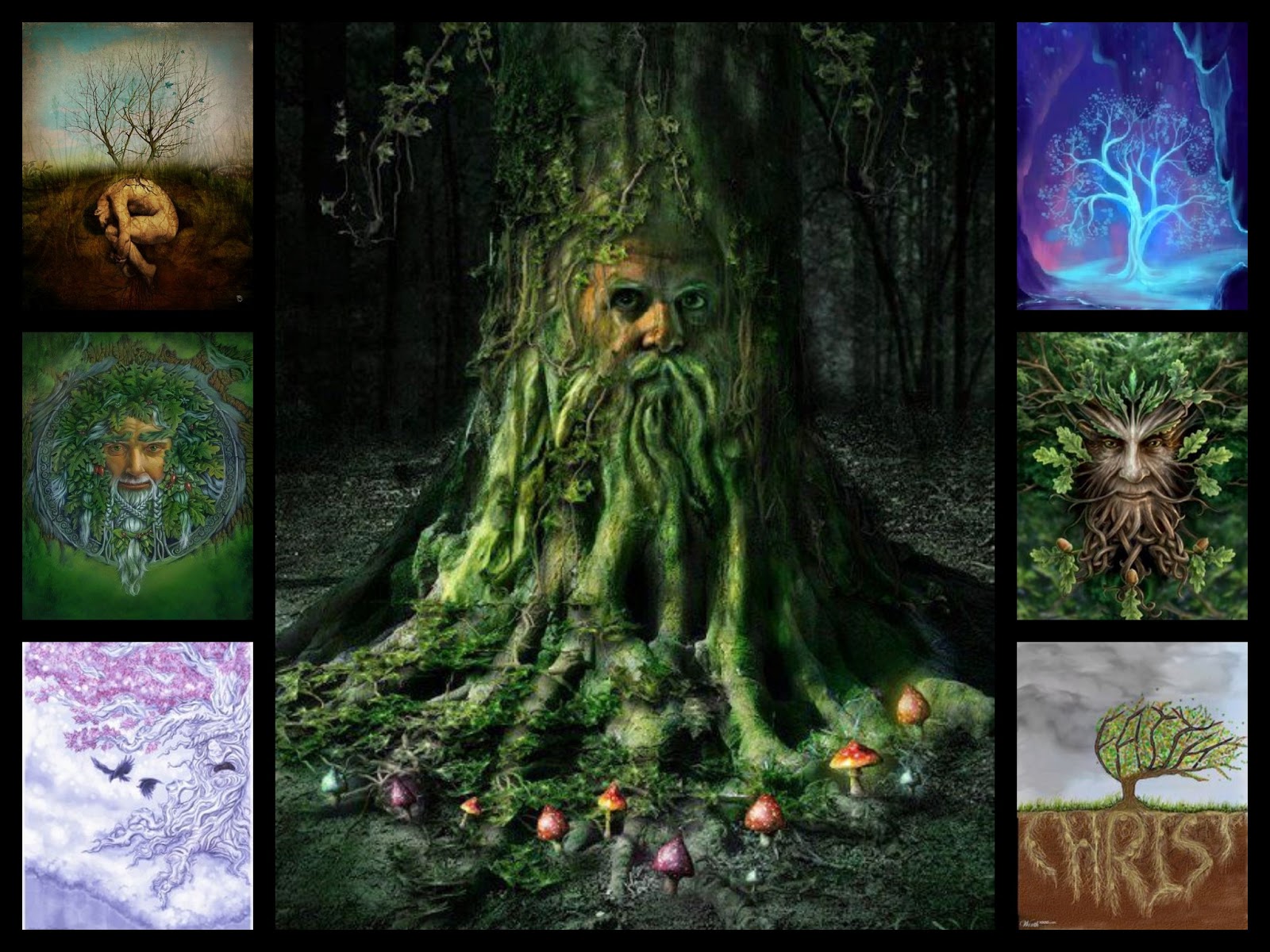
I found these images earlier on pinterest through looking up "Old Man Face Illustration". It has sparked many ideas for my movie poster and magazine.


Wednesday, 13 January 2016

New Poster Inspiration

Through further investigation into movie posters and a lot more brainstorming on what films i could reference back to, the perfect example came to mind, Pixars 'A Bugs Life'.

Once I looked up the posters I fell in love all over again, as well as this the posters began to spark an idea in my head. I love the way the leaf was used to create a border/background and it would reference perfectly to my film. The different styles and compositions are used cleverly as the bugs 'break the fourth wall' and peer through at their audience. I would want to recreate this by using the leaf in the foreground, the young boy in my script on the left, the old man on the right placed just behind the leaf and the tree in the background, slightly hidden between the two characters. Another composition like the one of them peering in from the side view could say be used for my magazine front cover.


Tuesday, 15 December 2015

Movie Poster Flat Plan

Again, looking back on animated films and how their movie posters are layed out I have created two of my own flatplans and I will chose the best one according to my target audience feedback on both images.


As you can see, a typical poster for an animation movie has a main image regarding the film in the centre, usually the title in a light hearted bubble like font at the bottom centre of the page(or top sometimes), followed by the release date underneath and either the main actors, a review or the directors name simply in the top centre.