Here is some of the experimental fonts I have been testing out to match my poster. Picking a font is easier like this because I can compare products side by side. Personally, I like the last version best. I changed the size and width to manipulate it to fit.
Showing posts with label Experimentation. Show all posts
Saturday, 6 February 2016
Monday, 1 February 2016
Adding Colour
I knew that adding colour would have a huge effect on the overall outcome of the poster so I experimented with a range of green hues. I primarily created a colour layer beneath the white illustration and above the black/grey background. I realy like the effect the airbrush tool had on the colour, it left it smooth and seemless like skin tone, but green. I started by selecting a large brush, around 200, selected a dark green hue and began to block i the dark areas of colour. As I worked my way closer to the higher parts of the face the natural contour, I then decreased my brush size and adjusted my colour closer and closer to white from dark green. I am pleased with the outcome, as I didnt think it would turn out as effective.
Sunday, 17 January 2016
Pintrest Inspiration
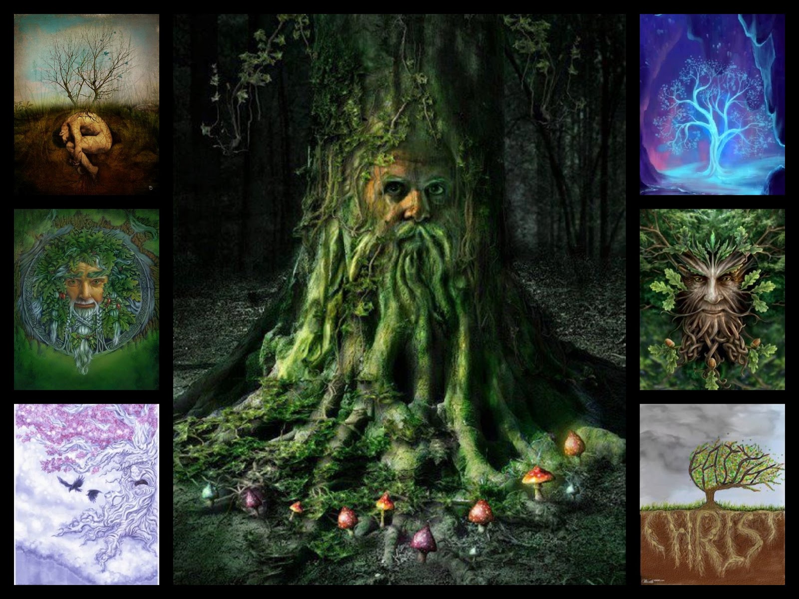
I found these images earlier on pinterest through looking up "Old Man Face Illustration". It has sparked many ideas for my movie poster and magazine.
Friday, 15 January 2016
Rotoscoping
In my teaser trailer I will be attempting to rotoscope images (draw over the top of them) to animate the live footage.
Rotoscoping is an animation technique in which animators trace over footage, frame by frame, for use in live-action and animated films. Originally, recorded live-action film images were projected onto a frosted glass panel and re-drawn by an animator. This projection equipment is called a rotoscope. Although this device was eventually replaced by computers, the process is still referred to as rotoscoping. In the visual effects industry, the term rotoscoping refers to the technique of manually creating a matte for an element on a live-action plate so it may be composited over another background.
A Scanner Darkly is a 2006 American adult animated science fiction thriller film directed by Richard Linklater based on the novel of the same name by Philip K. Dick. The film tells the story of identity and deception in a near-future dystopia constantly under intrusive high-technology police surveillance in the midst of a drug addiction epidemic. The film was shot digitally and then animated using interpolated rotoscope, an animation technique in which animators trace over the original footage frame by frame, for use in live-action and animated films, giving the finished result a distinctive animated look. It was distributed by Warner Independent Pictures and it was the first (and only so far) animated film released by Warner Independent Pictures.
After principal photography was finished, the film was transferred to QuickTime for a 18-month animation process: interpolated rotoscoping. A Scanner Darkly was filmed digitally using the Panasonic AG-DVX100 and then animated with Rotoshop, a proprietary graphics editing program created by Bob Sabiston.
Rotoshop uses an animation technique called interpolated rotoscope, which was previously used in Linklater's film Waking Life. Linklater discussed the ideas and inspiration behind his use of rotoscoping in Ashraf's documentary, linking it to his personal experiences of lucid dreaming. Rotoscoping in traditional cel animation originally involved tracing over film frame-by-frame. This is similar in some respects to the rotoscope style of filmmaker Ralph Bakshi. Rotoshop animation makes use of vector keyframes and interpolates the in-between frames automatically.
The animation phase was a trying process for Linklater who said, "I know how to make a movie, but I don't really know how to handle the animation." He had gone the animation route because he felt that there was very little animation targeted for adults.
In my A2 Art coursework I attempted a still form of rotoscoping
for my final piece. I realised quickly with rotoscoping that the artists that create them really emphasise and exaggerate the features of the image, making them slightly goofier, more like a caricature than real life person, giving off the animated feel and adding a lot more detail and depth to the work.
To do this I imported the image to Photoshop and used my Graphics tablet to draw over the top. My teaser trailer will have elements of this in it but mainly it will be pure animation. The image on the left is the picture I took of my friend Lucy, the image below is the illustration I created of it, using rotoscoping techniques.


Wednesday, 13 January 2016
New Poster Inspiration
Through further investigation into movie posters and a lot more brainstorming on what films i could reference back to, the perfect example came to mind, Pixars 'A Bugs Life'.
Once I looked up the posters I fell in love all over again, as well as this the posters began to spark an idea in my head. I love the way the leaf was used to create a border/background and it would reference perfectly to my film. The different styles and compositions are used cleverly as the bugs 'break the fourth wall' and peer through at their audience. I would want to recreate this by using the leaf in the foreground, the young boy in my script on the left, the old man on the right placed just behind the leaf and the tree in the background, slightly hidden between the two characters. Another composition like the one of them peering in from the side view could say be used for my magazine front cover.


Once I looked up the posters I fell in love all over again, as well as this the posters began to spark an idea in my head. I love the way the leaf was used to create a border/background and it would reference perfectly to my film. The different styles and compositions are used cleverly as the bugs 'break the fourth wall' and peer through at their audience. I would want to recreate this by using the leaf in the foreground, the young boy in my script on the left, the old man on the right placed just behind the leaf and the tree in the background, slightly hidden between the two characters. Another composition like the one of them peering in from the side view could say be used for my magazine front cover.


Saturday, 2 January 2016
Photoshop CC 2015
So today I downloaded the 30 day free trial of Photoshop CC 2015 as I heard it was quite a lot more advanced with the animation settings in comparison to Photoshop CS6, which Is what I previously had.
At first glance it looked so similar to CS6 but the settings are so much more advanced! And easier to use, this was my first (extremly rough) animation from it, just experimenting with the title as I wanted to get into it straight away!
Photoshop CC 2015, I'm impressed.
At first glance it looked so similar to CS6 but the settings are so much more advanced! And easier to use, this was my first (extremly rough) animation from it, just experimenting with the title as I wanted to get into it straight away!
Photoshop CC 2015, I'm impressed.
Subscribe to:
Posts (Atom)